Have you ever noticed how some brands just stick in your mind? It’s not just their catchy slogans or great products their colors play a significant role, too. This is the magic of brand color psychology.
Colors aren’t just for aesthetics; they connect with our emotions and influence our decisions, often without us realizing it. Furthermore, from choosing between two products to deciding which website feels more trustworthy, color can make all the difference.
In this blog, we’ll explore what brand color psychology is, why it matters, and how you can use it to make smarter branding decisions. Let’s dive in!
What is Brand Color Psychology?
Brand color psychology studies how colors affect human behavior and emotions. It’s more than just picking a pretty shade; it’s about understanding how colors influence moods, trigger emotional connections, and drive actions, like making a purchase or trusting a brand.
For example, blue often feels calm and trustworthy, while red conveys energy and urgency. But remember, culture, personal preferences, and even context can shape how people perceive colors.
Why Does Color Matter in Branding?
Colors aren’t just visual elements — they’re tools that influence how people feel about your brand. Here’s why they’re so important:
- Increase Recognition: Using consistent colors can increase brand recognition by 80%.
- Shape Perceptions: Colors like green can make your brand feel fresh, while black can feel luxurious.
- Influence Decisions: Visual appeal, driven by color, impacts 93% of purchase decisions.
Take Coca-Cola’s iconic red or Facebook’s calming blue. These colors are more than design choices; they’re part of what makes these brands unforgettable.
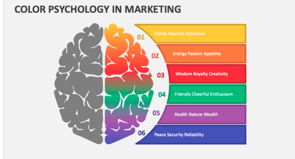
Marketing Color Psychology Chart
3 Tips to Use Colors for Branding Decisions
1. Choose Colors That Fit Your Brand
The right color isn’t just about looking good; it should match your brand’s identity and message. Moreover, a study showed that the “perceived fit” of a color can significantly impact how people view a brand.
Example:
- Whole Foods uses green to symbolize health and freshness.
- McDonald’s pairs red and yellow to evoke energy and happiness.
Ask yourself: What emotions do I want my brand to evoke?
2. Use Colors That Match Your Brand Personality
Every brand has a personality. Are you bold and energetic or calm and trustworthy? Psychologist Jennifer Aaker’s five “Dimensions of Brand Personality” can help you decide:
- Excitement: Use bright colors like red or orange.
- Sophistication: Go for black, gold, or purple.
- Trustworthiness: Blue is your go-to.
Example: Netflix’s red signals passion and excitement, while Hallmark’s purple conveys sophistication.
3. Pick Colors That Differentiate Your Brand
Stand out by using colors that are unique in your industry. This makes your brand more memorable and helps avoid blending in with competitors.
Tips: Avoid using the same colors as your main competitors and test how your colors look in different settings (e.g., online vs. print).
Example: Nickelodeon’s orange stands out in the children’s entertainment industry.
Examples of Colors in Action
- Blue: Trust and security (e.g., Facebook, Twitter). Blue conveys feelings of reliability and calmness, making it popular among tech and financial brands.
- Red: Passion and urgency (e.g., Coca-Cola, Netflix). Red is energetic and attention-grabbing, often used for call-to-action buttons and food brands.
- Green: Health and freshness (e.g., Whole Foods). Green is associated with nature and well-being, perfect for eco-friendly or health-focused brands.
- Yellow: Happiness and creativity (e.g., McDonald’s). Yellow evokes warmth and optimism, often appealing to younger audiences.
- Black: Power and elegance (e.g., Nike). Black is sleek and sophisticated, ideal for luxury or high-end products.
- White: Simplicity and purity (e.g., Apple). White gives a clean, modern feel, often used for minimalist branding.
The Role of Typography and Color Theory in Effective Branding
When it comes to creating a memorable brand, typography and color theory go hand in hand. Both are essential for communicating your brand’s personality, values, and message. Let’s break this down into simple terms.
Typography: Why It Matters
Typography is all about the fonts you use in your branding. Just like colors, fonts can evoke emotions and shape perceptions. For example:
- Bold, thick fonts feel strong and dependable (think Nike).
- Script or handwritten fonts feel elegant and personal (like Hallmark).
- Clean, sans-serif fonts are modern and minimal (such as Google).
When choosing typography, ask yourself:
- Does this font match my brand’s personality?
- Is it easy to read, even at smaller sizes?
- Does it pair well with other design elements, like my logo or color palette?
Color Theory: Why It’s a Game-Changer
Color theory is the art and science of choosing colors that work well together and create the right mood. By understanding how colors interact, you can ensure your brand looks polished and professional.
For example:
- Complementary colors (like blue and orange) create contrast and grab attention.
- Analogous colors (like blue and green) feel harmonious and calm.
- Monochromatic schemes (different shades of one color) feel cohesive and sleek.
When applying color theory, keep these tips in mind:
- Stick to a limited color palette for consistency.
- Use accent colors to highlight important elements like call-to-action buttons.
- Test your colors across different platforms (e.g., websites and print materials) to ensure they look great everywhere.
Why Combining Typography and Color Matters
Together, typography and color create a unified look that makes your brand memorable and appealing. Imagine a bold red logo paired with a sleek, modern font—it communicates energy and sophistication in seconds!
Tip: Keep your audience in mind. Bright, playful colors with fun fonts might work for a kids’ brand but could feel out of place for a luxury product.
By mastering both typography and color theory, you’ll have the tools to build a brand that not only stands out but also connects with your audience emotionally and visually.
How to Research the Right Colors for Your Brand
- Know Your Audience: What colors resonate with them? Conduct surveys or interviews.
- Use A/B Testing: Test different color options for logos or call-to-action buttons to see what performs best.
- Study Competitors: See what colors they use and find ways to differentiate.
Conclusion
Color isn’t just a design element; it’s a powerful tool for shaping perceptions, building connections, and driving decisions. By understanding brand color psychology, you can create a brand that resonates emotionally and stands out visually. Experiment, test, and find the colors that best represent your brand.
FAQs
What is color psychology in branding?
It’s the study of how colors influence emotions and decisions, helping brands connect with their audience.
How does color affect brand?
Colors shape perceptions, emotions, and buying decisions, making them crucial for branding.
What is the most powerful color in branding?
There’s no single answer, but red often conveys urgency, and blue builds trust.
What is the marketing color psychology chart?
It’s a guide that shows how different colors evoke specific emotions and brand associations.
Why is color important in branding?
Color increases recognition, connects emotionally, and influences buying decisions.