Ever felt unsure about what to do next on a website? A clear call to action button changes everything. It’s like an approach to guide you to take the next step, whether that’s signing up for a newsletter, buying a product, or reading more. Without a well-placed and well-written CTA, your audience might leave without taking action. And let’s face it, that’s the last thing you want.
A call to action button doesn’t just help your audience; it helps you. It’s a bridge connecting your goals with the needs of your audience. In this blog, we’ll explore how CTAs work, why they’re important, and how you can use them to make your content stand out. Let’s dive in.
What are CTAs in Marketing?
A call to action button is a small but influential part of your website or content. It tells people what to do next. Think of buttons that say “Sign Up Now” or “Get Started.” These simple phrases give your audience clear directions.
CTAs come in many forms, you might see them as colorful buttons on a website, a pop-up that grabs your attention, or even a link in a blog post. No matter where they appear, they have one goal: to guide users toward an action that benefits both them and your business.
Why Call to Action Buttons Matter
Drive Action
A good CTA makes it easy for people to engage with your content or brand. It simplifies their decision-making process and helps them feel confident about their next steps. Without a clear call to action button, even the most beautifully designed website or engaging content can fall flat.
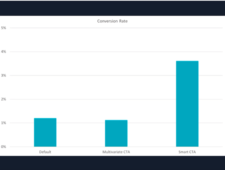
According to Hubspot, customized CTA is the best CTA as it outplays basic CTA by 202%
Improve User Experience
CTAs also improve user experience. They make it easier for people to find what they’re looking for. For example, if someone is reading about a product, a “Learn More” button can guide them to detailed information. It saves them time and creates a smoother journey.
Create Urgency and Increase Conversions
On top of that, CTAs can create urgency. Words like “Limited Time Offer” or “Only a Few Left” encourage people to act quickly. This fear of missing out can increase conversions and help you achieve your goals faster.
3 Ways to Properly Use CTAs in Your Content
Tip 1: Keep Your CTAs Short and Clear
The first step is to keep your CTAs short and clear. People don’t want to read long sentences. A simple, enticing call to action like “Try it Free” or “Buy Now” works wonders. Be direct about what you’re offering and why it’s valuable.
For example, instead of saying, “Click Here to Learn About Our Amazing App,” say, “Discover the App That Simplifies Your Life.”
Tip 2: Use Call to Action Buttons for Emphasis
Next, make sure your CTAs stand out. Use bright colors or bold fonts to grab attention. A call to action button should be easy to spot at a glance. If it blends into the rest of your content, people might miss it.
Placing it strategically is also important. Think about where the user might naturally look for the next step. Common spots include the end of a blog post, the top of a webpage, or even within a pop-up.
Tip 3: Link to Relevant Landing Pages
Finally, link your CTAs to the right pages. If your button says “Shop the Collection,” it should take users directly to the collection’s page, not your homepage. Besides, the goal is to create a seamless experience. The fewer clicks your audience has to make, the more likely they are to follow through.
9 Types of CTAs (And How to Use Them)
Lead Generation CTAs
These CTAs help you collect contact information from your audience. Use them to encourage signups for newsletters or offers. For example, “Subscribe Now for Weekly Tips” or “Join Today for Free.” Place them on pop-ups, sidebars, or at the end of articles.
Social Sharing Buttons
Social sharing CTAs encourage users to share your content with their network. Add buttons for platforms like Twitter, Facebook, or LinkedIn. Use phrases like “Share This Post” or “Spread the Word” to make them engaging.
Purchase CTAs
Purchase CTAs help drive sales by leading users directly to your product or checkout page. Examples include “Add to Cart,” “Buy Now,” or “Shop the Sale.” Use them on product pages or within promotional emails.
Online Forms
Use online form CTAs to collect valuable information for free trials, consultations, or callback requests. Phrases like “Request a Demo” or “Sign Up for Free” work well. Keep the form simple to fill out.
Email CTAs
Email CTAs encourage action through targeted messages. Examples include “Claim Your Discount Now” or “Complete Your Purchase.” Use them to re-engage users or promote limited-time offers.
Read More CTAs
These CTAs keep users engaged by directing them to additional content. For example, “Read the Full Story” or “Learn More About This Topic.” They are common in blogs, news sites, and article summaries.
Free Trial or Subscription CTAs
Encourage users to try your service with CTAs like “Start Your Free Trial” or “Get One Month Free.” These work best for SaaS companies or subscription-based businesses.
Event Promotion CTAs
Use CTAs to promote events like webinars or workshops. Examples include “Save Your Seat” or “Register Now.” Highlight the value of attending the event to attract more signups.
Feedback CTAs
Gather opinions from your audience using feedback CTAs. Phrases like “Share Your Thoughts” or “Take Our Survey” encourage users to share valuable insights. Additionally, keep the process simple to increase participation.
Best Practices for Crafting CTAs
Crafting a strong call to action button isn’t hard, but it does take some thought. Start by choosing words that resonate with your audience.
For example, if you’re targeting busy parents, phrases like “Save Time Today” might work well. The best call to action phrases are relatable and speak directly to your audience’s needs.
Color also plays a significant role. A button in a contrasting color is more likely to catch the eye. For instance, if your website is primarily blue, a bright orange or red button will stand out. But don’t go overboard with too many colors. Keep it simple and clean.
Personalization is another excellent tactic. Adding words like “Your” or “You” can make the CTA feel more tailored. For instance, “Start Your Free Trial” feels more personal than “Start Free Trial.” Small changes like this can make a big difference.
Conclusion
A call to action button might seem small, but it can have a big impact. Make sure CTA placement is comprehensible to keep it visible and relevant to push your audience to take meaningful action. Moreover, start experimenting with CTAs today and watch your engagement grow. Remember, the right button can transform your content and help you achieve your goals faster.
FAQs
What is a call to action example?
A call to action (CTA) could be “Sign up now,” “Learn more,” or “Buy today.” It encourages users to take specific steps.
What is a call to action in writing?
In writing, a CTA motivates readers to act, like clicking a link, subscribing, or downloading a resource.
Do you include cta buttons at top of blog posts?
Yes, placing a CTA at the top grabs attention early, but add more in the middle and end for better engagement.
What’s the best cta to use on your LinkedIn profile?
Use action phrases like “Let’s connect,” “Check my portfolio,” or “Message me for collaboration.”